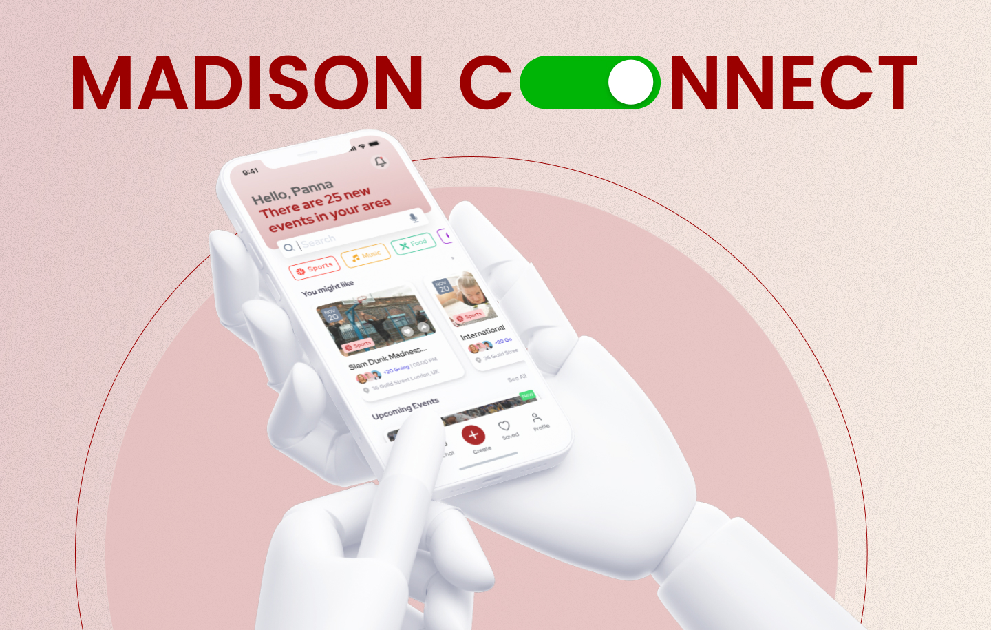
Madison Connect
Problem Statement
The challenges faced by international students in Madison stem from a combination of factors, including cultural differences, academic expectations and financial constraints. These factors create barriers to successful adaptation and integration into the new environment, leading to various struggles for international students.
6,000K + - International
(F- & J-visa)
116+ - Countries
40% - Experience Loneliness
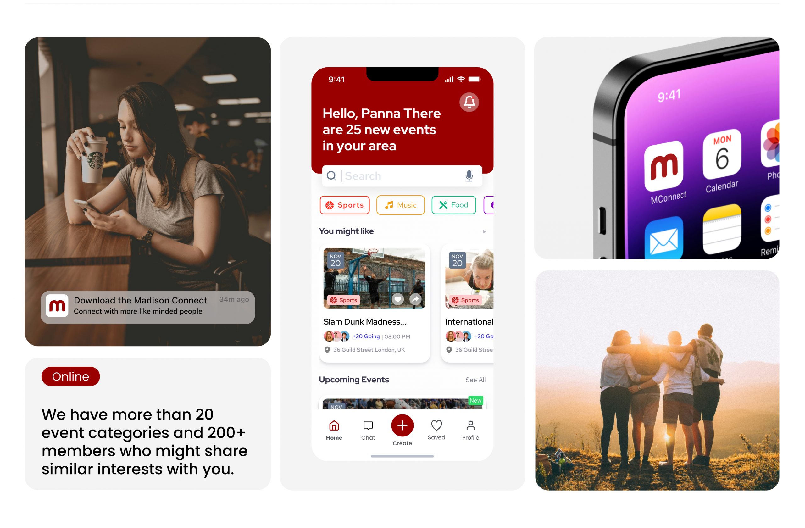
MADISON CONNECT - iOS App Design
How might we empower international students to actively engage and settle within Madison, enabling them to uncover its hidden gems and unique experiences?
01
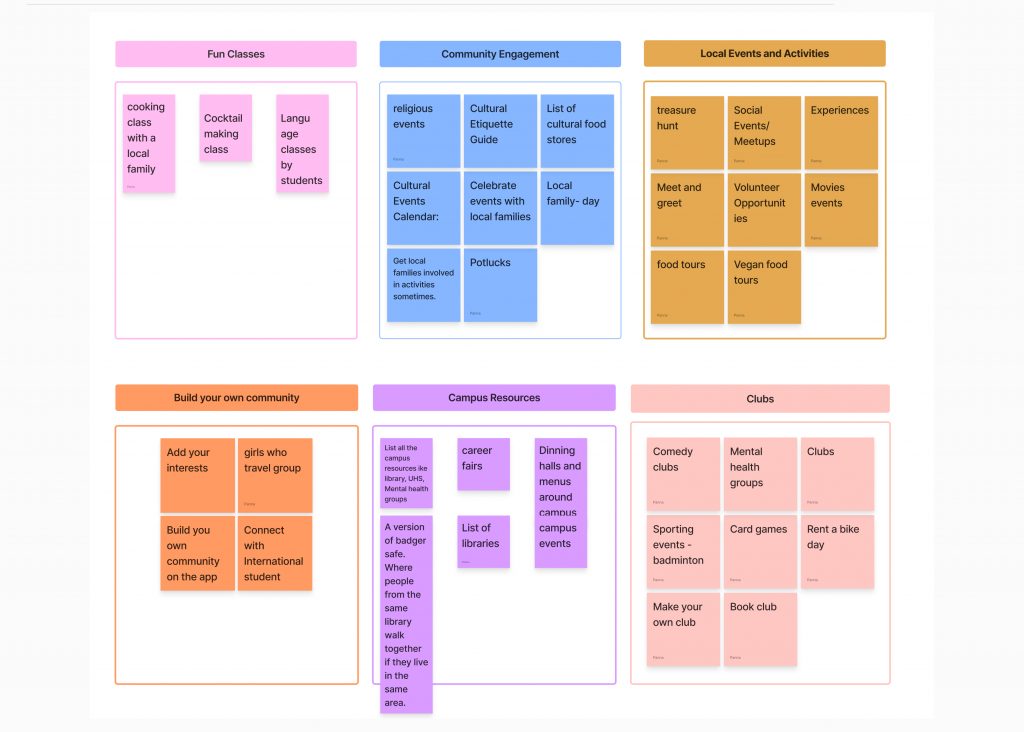
Brainstorming - Getting the ideas out of my head
I conducted a brainstorming session to generate a diverse range of ideas and perspectives for the MadisonConnect app, to develop innovative solutions and features.
02
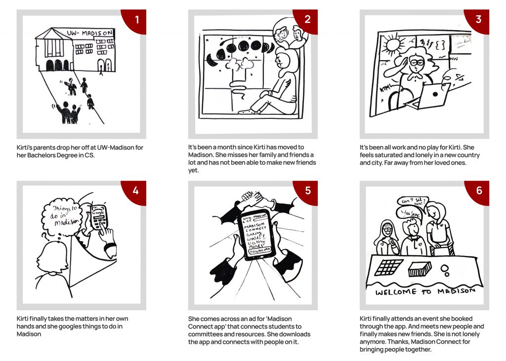
Storyboard - Getting the ideas out of my head
I used storyboards to visually map out the user’s journey and emotions as they interacted with our design. By creating a series of frames, I illustrated each step the user takes and highlighted their emotional responses, from initial engagement to problem-solving and goal achievement. This approach helped stakeholders see beyond the technical aspects and understand the user’s experience on a deeper level. The storyboards clearly depicted moments of joy, frustration, and satisfaction, providing a vivid narrative that aligned our design choices with the users’ emotional needs and expectations.
03
TaskFlows-Piecing it together
I created task flows to outline the user’s step-by-step interactions with our design. These visual maps detailed each action required to complete key tasks, helping us streamline the user experience and identify potential improvements.
04
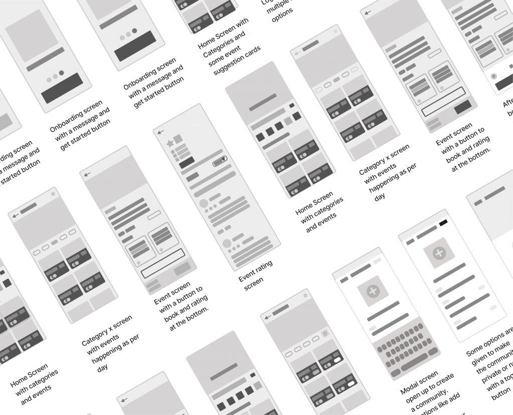
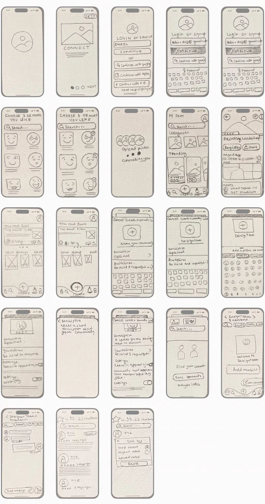
Paper Wireframes
I created wireframes to lay out the structure and functionality of our design in a simplified, visual format. These blueprints helped me focus on the core elements and user flow without distractions from design details. Wireframes were crucial in identifying and resolving usability issues early on, ensuring a smooth and efficient user experience.
05
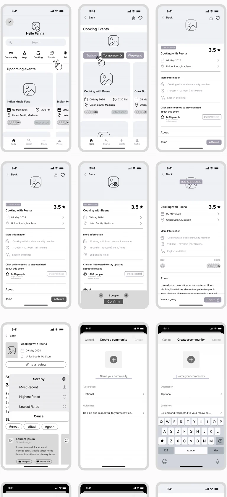
Digital Wireframes
After the initial sketches, I created digital wireframes to refine and develop the design more precisely. These digital versions allowed me to integrate more detailed elements and interactions, making it easier to test and iterate on the layout. Creating digital wireframes helped me visualize the design in a more realistic context, ensuring that the user interface would function effectively across different devices and screen sizes.
06
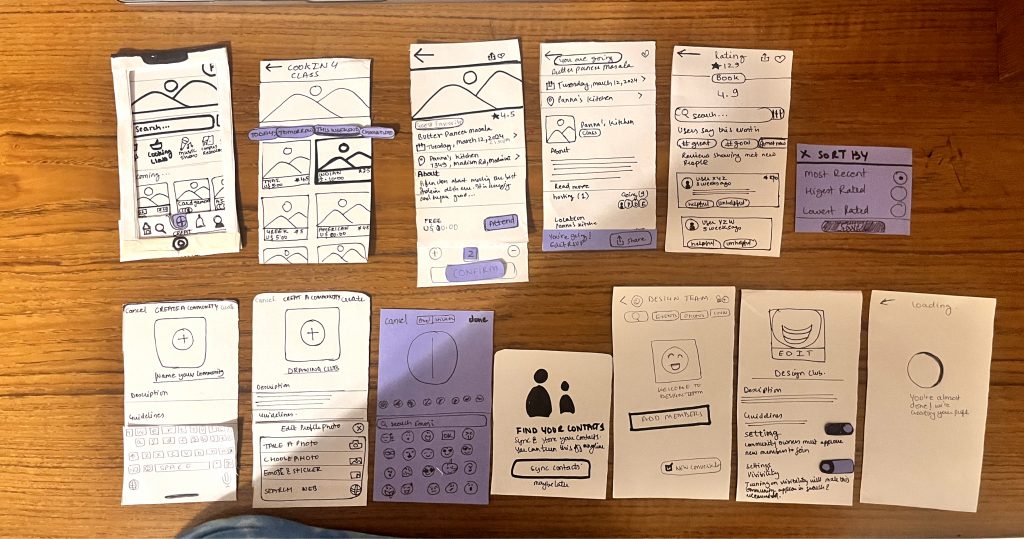
Paper Prototypes - Piecing it together
I tested my paper prototypes with users by conducting hands-on sessions where they interacted with the sketches, providing real-time feedback that highlighted usability issues and improvement opportunities.
USER 1: Anita
- User suggested adding an “add to calendar” option on the main events page.
- She found group creation intuitive but suggested an alternative to syncing contacts.
- User highlighted the usefulness of tags in group chats and proposed expanding their functionality.
- Initially, she misunderstood the attended circles on the homepage.
USER 3 Ronny
- He found the group chat homepage overwhelming due to excessive text.
- Ronny suggested adding an “add to calendar” option on the main event page, accessible via the chevron icon, to help users remember events.
- He preferred manually selecting contacts from the phonebook when adding them on the group page, rather than syncing automatically.
USER 2 – Aaron
- Aaron emphasised the importance of a share button on the groups he creates, expressing a strong desire for its inclusion.
- Additionally, he requested an “add-to-calendar” option on the main event page, accessible by clicking on the chevron icon.
- He noted the challenge of locating the rating and suggested enhancing its visibility by enlarging and highlighting it on the page.
07
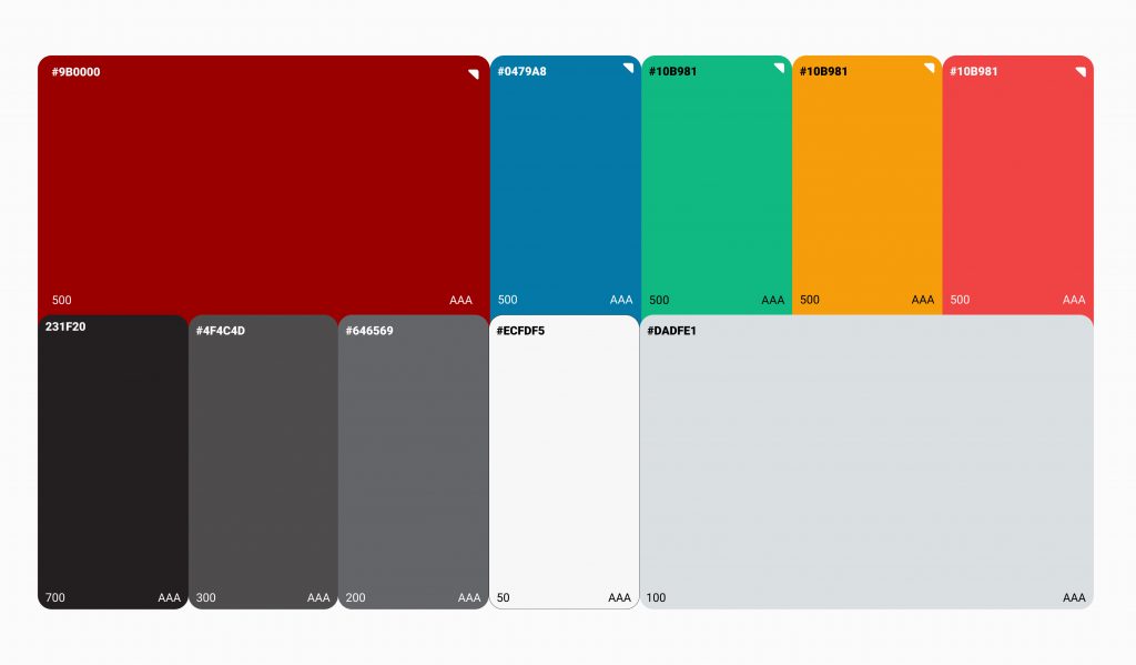
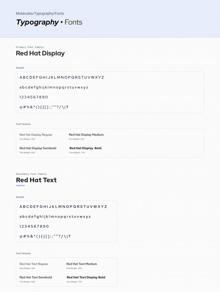
Components & Style Guide - Different parts that make the whole
I created components to maintain consistency across the app and feature. The components did not only help me in designing but also will allow the devs to reuse components thereby increasing code efficiency
