Tools Used
- Figma
- Photoshop
- Illustrator
- Indesign
Skills Gained
- Design System
- iOS App Design
- Understanding HIG
- Responsive Design
Food & Fest App
You can find and reserve a table at the top restaurants in your city with Food & Fest.
To choose the ideal restaurant and table, you may look at pictures of the interiors, the design, the costs, and read full reviews. The customer may use the F&F app to see where the restaurant’s tables are located, pick the seats they like, and place a
pre-order that will be ready for them when they arrive.
Problem Statement
Millennials need a reliable restaurant booking app to enjoy a hassle-free dining experience, saving their limited time.
01
COLOUR PALETTE
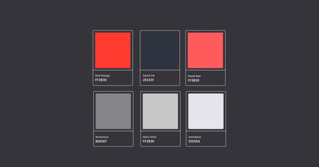
The reason for using red as a primary colour is because red triggers stimulation, appetite, and hunger, it attracts attention. The other colours are neutral to give the app a premium look and feel. And to avoid distraction on the app.
02
TYPEFACE
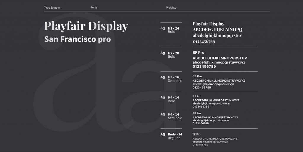
I have used SF pro font because it is clear and easy to read, even at small sizes. It also has a modern, professional aesthetic that makes it suitable for a wide range of applications.
03
SEAMLESS ONBOARDING
The app appears warm and approachable yet chic and high-end because of the disproportionate illustration style as well as the minimal use of colour. Pack of cards design will encourages user to interact and provide them with an engaging experience right away.

04
REGISTER & LOGIN SCREENS
With Food and Fest, the user may log in and open a new account. The login screen features a chick-style illustration with very little colour. To reduce cognitive strain so that the user can take action quickly.

05
HOME SCREEN
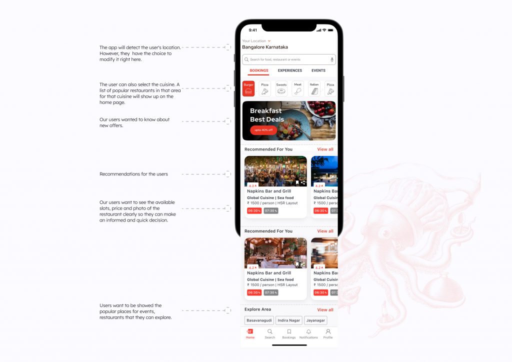
The home screen gives the users multiple options to find what they want to do. Starting from the search section, then sub menu section where they can search popular events, book a table. Also have an option to search via cuisines.
06
EASY BOOKING FLOW
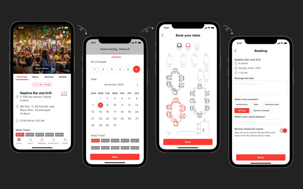
Our users wanted to see clear photos of the restaurant so we have given that section right on top so it is easily visible. Clear time slots so that the user has all the information to make a decision quickly. The user can select their own table this option will delight the user.
07
BOOKING CONFIRMATION
&
INVITATION FLOW
Our app streamlines the dining experience by allowing users to take multiple actions from the same screen. With the “Message the Restaurant” feature, users can easily contact the restaurant without navigating away. The integrated map helps them check the distance to the venue. Additionally, users can invite guests directly from the app, ensuring friends and family don’t miss out on the get-together.

08
PRE-ORDER FOOD FLOW
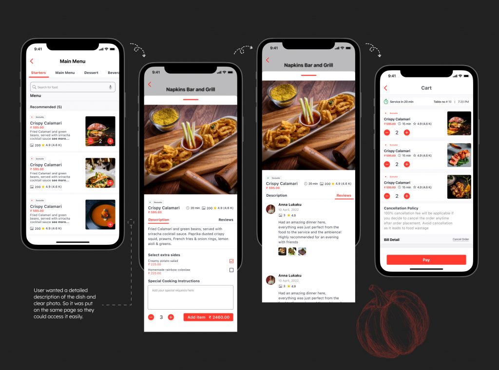
After booking a table, users can pre-order their food and make the payment in advance. This allows the restaurant to prepare and serve the food as soon as the users arrive, reducing waiting time and enhancing the dining experience, leading to customer delight.
09
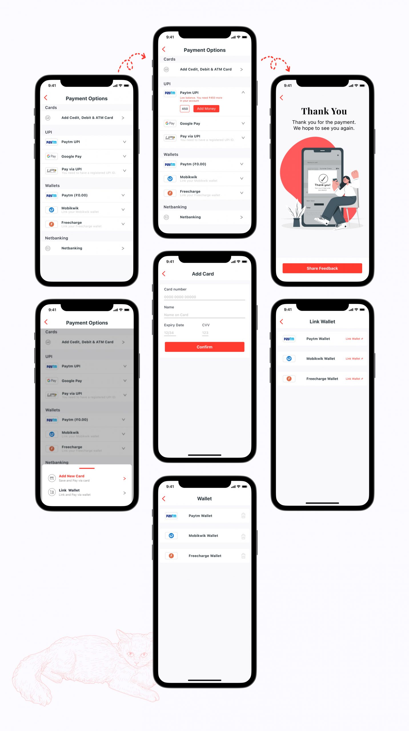
EASY PAYMENT FLOW
Creating an easy payment flow with minimal clicks is crucial for enhancing the user experience and encouraging users to complete their transactions. A smooth and straightforward payment process not only simplifies the journey but also fosters trust and confidence in the app. This trust is vital for cultivating long-term customer relationships and ensuring user satisfaction.

