ADI
Project Brief
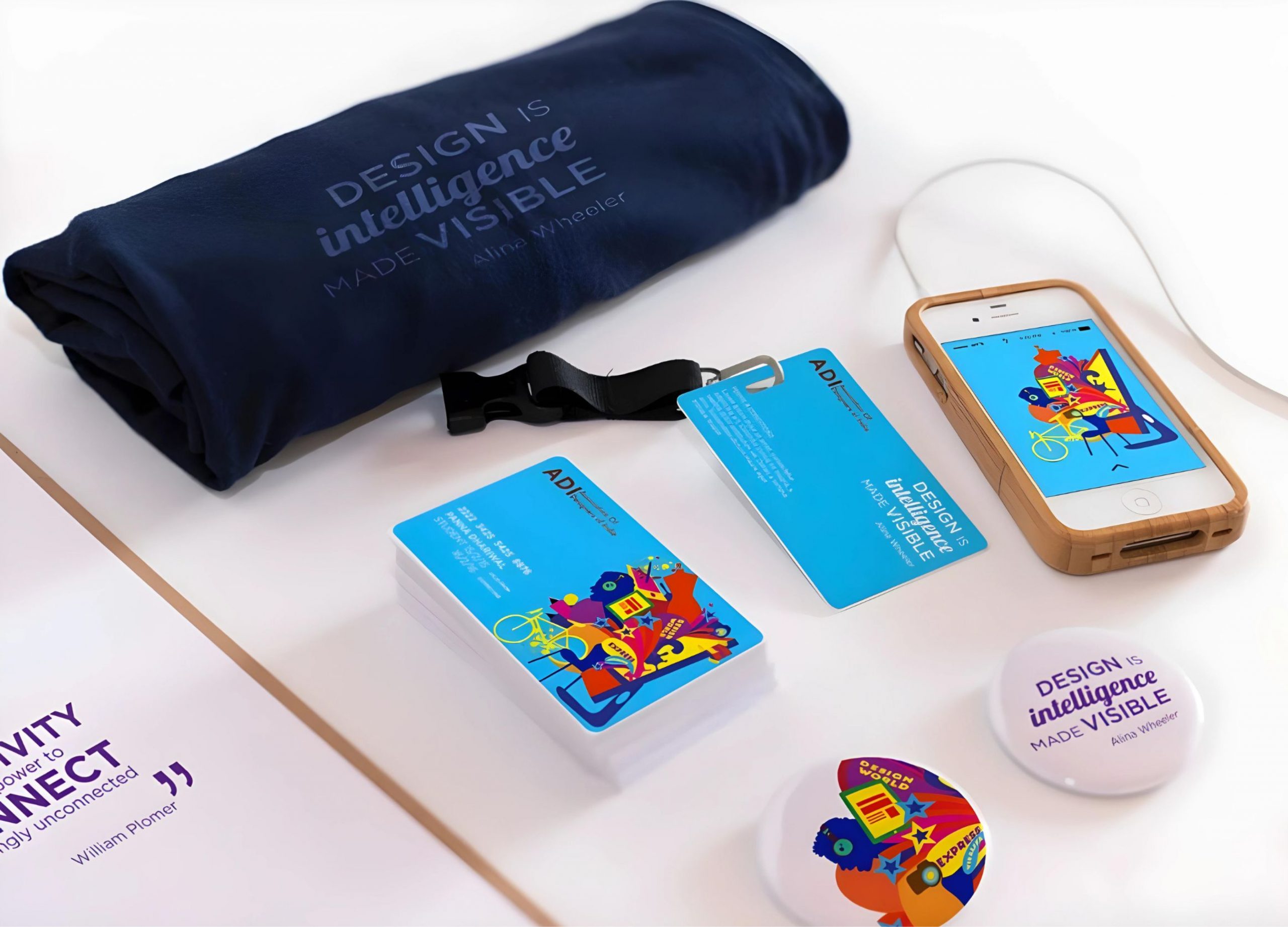
ADI tasked us with designing membership cards for their diverse community, which includes photographers, architects, interior and web designers, graphic artists, and more. The cards should symbolise unity and inclusivity, representing the broad range of design talents within ADI without
favouring any specific discipline.
Concept 1 | Fun | Quirky
I chose an illustrative approach for the membership cards because it offers flexibility and resonates with all designers, who often start their creative process with pencil and paper. This approach allowed me to stay adaptable and seamlessly integrate elements from various design disciplines, creating a unified representation that captures the essence of the entire design community.

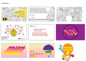
Trial and Errors
Concept 2 | Simple | Clean
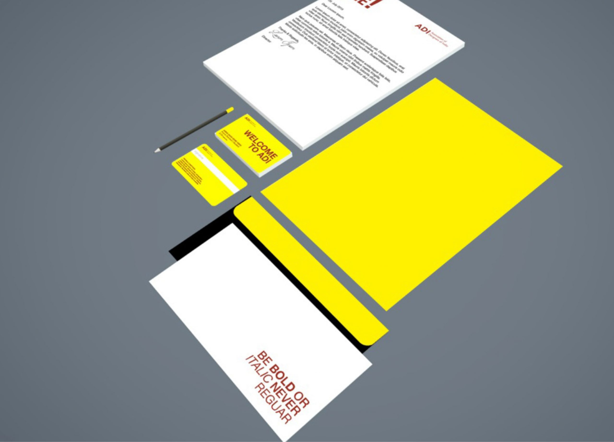
I also explored a minimalist approach because a clean, straightforward design effectively represents all designers without emphasizing any specific field. I used yellow because it represents happiness.

Concept 3 | Illustration style
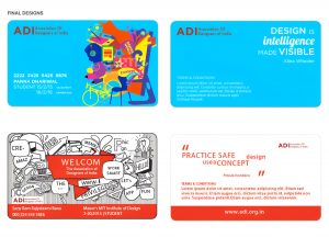
I chose a doodle approach because it captures the spontaneous and creative spirit common to all designers. Doodles are versatile and playful, allowing for a representation that is both inclusive and engaging. This approach reflects the initial stages of the creative process, where ideas flow freely and evolve naturally, making it a perfect fit to embody the diverse and dynamic nature of the design community.


