Research Methods
- Competitive Analysis
- User Research
- User Persona
- Problem statement
- User Journey
- Lo-fi Wireframes
- Visual Design
- Usability testing in progress
Tools
- Figma
Deliverables
• Redesigned Dashboard
Timeline
• 2.5 Weeks
Problem
Students face significant barriers in managing their student loans due to misinformation, lack of access to reliable information, and inadequate customer service. Delays and gaps in communication, coupled with an outdated and unintuitive website, hinder their ability to navigate the loan process effectively. As a result, students often feel frustrated and unsupported, experiencing a cycle of confusion and dissatisfaction.
Overview
>> I created this project as a part of a design challenge.
>> Challenge: Your challenge is to redesign the UX/UI of the homepage only.
1. The redesign should maintain the same functionality.
2. Information architecture modifications are welcome, the left-hand nav can be modified.
3. The redesign should be created in Figma, using components, variants, and styles.
4. You may rewrite the instructional text and other copies if you find it necessary.
5. The redesign should use a modern UI.
6. Lack of Understanding of Target audience.
Goal
Help 42.8 million American students pay off their loans faster and with ease.
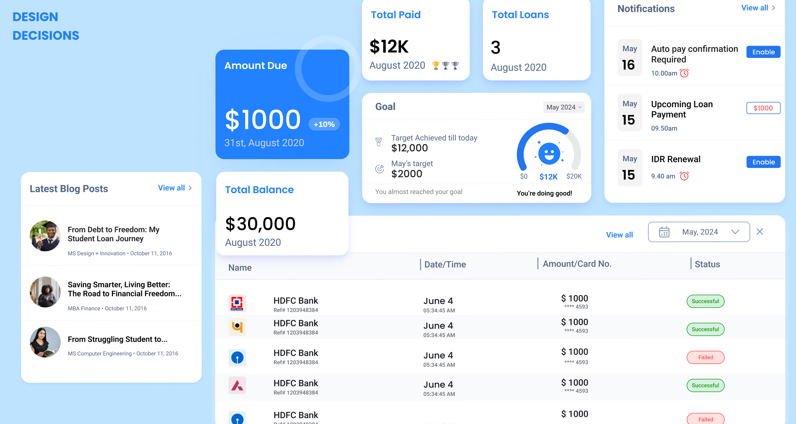
Proposed Solution ⤵️

Current Solution ⤵
Key Insights from the Audit
- Inconsistent Naming Conventions: Naming conventions lack clarity and consistency.
- Primary Action Buttons: Primary buttons should not feature chevrons or options to reinforce direct action.
- Lack of Visibility of Urgent Actions: Critical actions are hidden by dense text; absence of clear call-to-action (CTA) buttons.
- Unclear CTA: “Act Now” lacks clarity as a CTA; color should be more visually prominent (e.g., use alert color like red).
- Cognitive Overload: Excessive information leads to cognitive overload; content needs to be streamlined for improved clarity.
- Highlighting Critical Alerts: Missed payments should be visually emphasized in red to convey urgency.
- Lack of Design Consistency: design elements do not maintain visual consistency throughout the interface.
- Lack of Positive Reinforcement: “PAID in FULL and Congratulations” should be prominently displayed to enhance user motivation.
- Redundant Content: Steps 7 and 8 present redundant information; and require reorganization for improved clarity and flow.
- Card Sorting Activity: A card sorting exercise is recommended to optimize navigation structure and naming conventions for the target audience.
Competitive Analysis

Gap Analysis - Key Insights

Secondary User Research
My secondary research revealed that a higher number of Black borrowers are facing challenges in repaying their student loans.
76.1%.
BLACK STUDENTS ARE THE MOST LIKELY TO BORROW FEDERAL LOANS FOR THEIR UNDERGRADUATE DEGREE
$25,000
BLACK OR AFRICAN AMERICAN STUDENT OWE $25,000 MORE THAN WHITE OR CAUCASIAN BORROWERS
40%
OF BLACK STUDENTS AND 22% OF WHITE STUDENTS ACCUM-ULATE DEBT FOR GRADUATE SCHOOL.
$1.5 trillion
THE NATIONAL STUDENT DEBT IN UNITED STATES
$30,000
AVG AMOUNT UNDERGRADS ARE GRADUATING 30k DEBT
$35,000
BUT THE AVG DEBT OF A BLACK GRADUATE IS $35,000
Students have enough on their plate with the pressures of school. When loan services aren’t helpful and debt becomes overwhelming, it only makes things worse. This added stress can lead to discouragement, and some students might end up not paying their loans either.
Desk Research
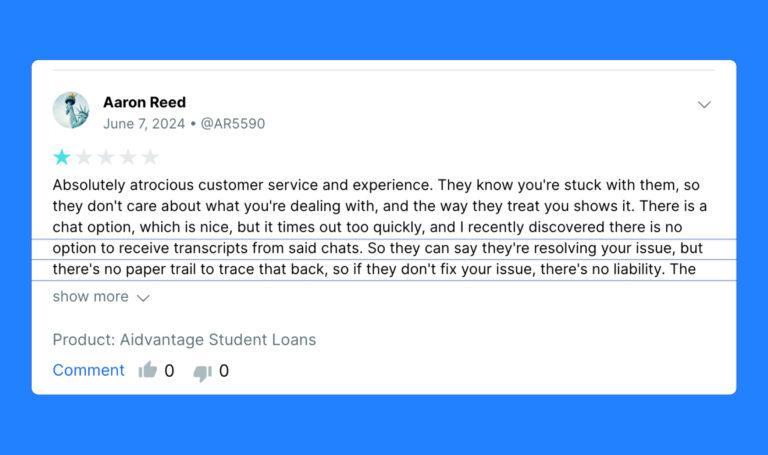
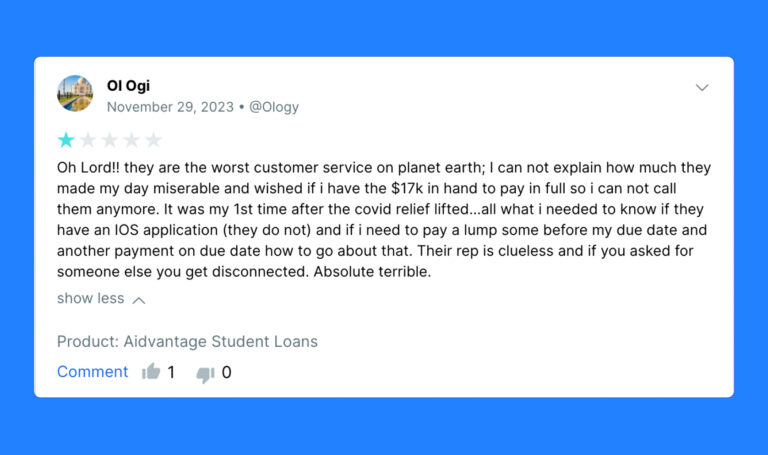
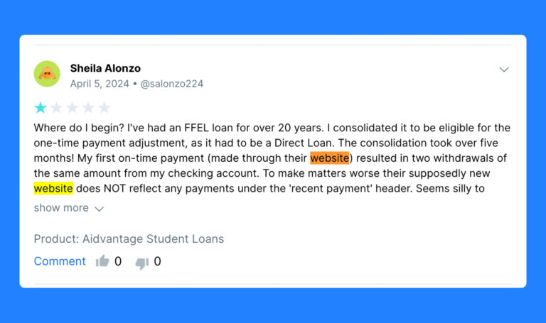
I turned to desk research to gather insights since I didn’t have the chance to connect directly with the audience for interviews or surveys.
Painpoints discovered
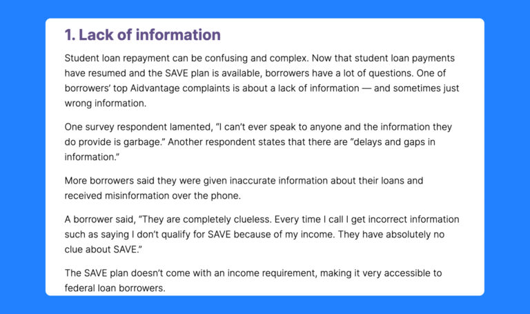
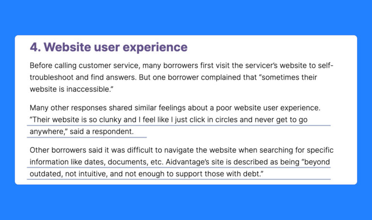
1. Outdated Website
Users find it difficult to navigate or access current information, leading to frustration.
2. No Proof of Chats
Customers lack a reliable record of previous interactions, causing confusion and mistrust in the service.
3. Lack of Care by CS
Customers service is unresponsive or inadequate support, leading to dissatisfaction and potential loss of trust in the company.
4. Lack of Information
Insufficient details on loan options may result in customers feeling uninformed, hindering their decision-making process.
5. Failed transactions
Customers are left frustrated when failed student loan payments go unnoticed due to the lack of real-time alerts or visibility on the dashboards.
How might we empower students, especially Black students, to easily manage their loans, access accurate information, and receive empathetic customer service?
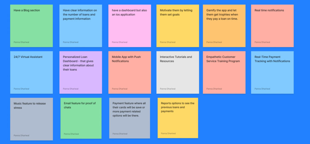
Persona

Usability testing - coming soon
USERS
